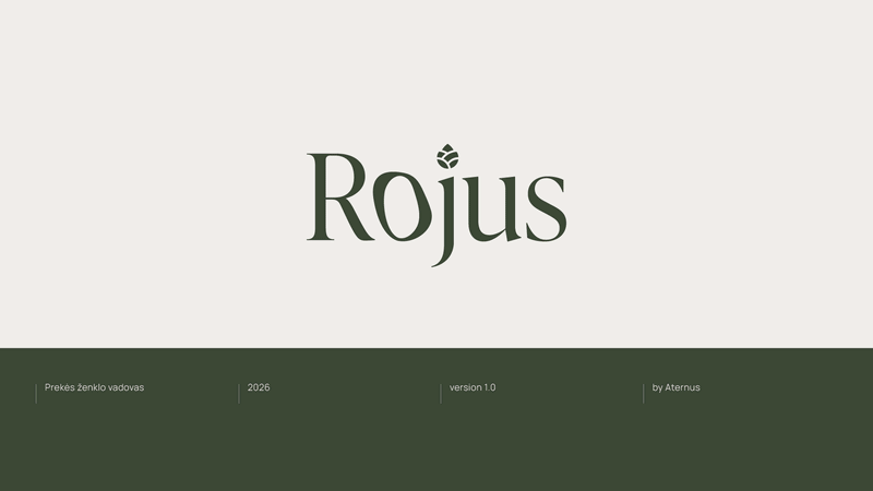
ROJUS NAMAI
VISUAL IDENTITY
Client: "ATERNUS"
2026
This rebrand was created for Rojus (meaning “Paradise” in Lithuanian), an existing housing project that needed a more clear and distinctive identity. The client felt their current branding did not reflect the real essence of the project - a premium, individual luxury homes, surrounded by pine forests, designed for people who value privacy, comfort, and a slower pace.
My role: I developed the visual direction and identity system - from the concept and aesthetic principles to the logo, typography, color palette, graphic elements, and the final brand guidelines and applications.
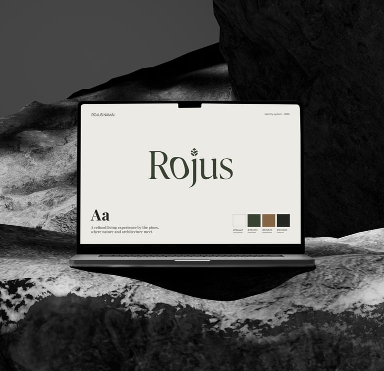
The new direction focuses on a minimal, modern, luxury feel with a subtle touch of nature - closer to spa-like living than traditional real estate branding.
The system combines refined typography, a calm material-inspired palette, and understated graphic elements that nod to the surrounding landscape, creating a consistent look.
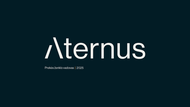
ATERNUS
VISUAL IDENTITY
Client: "ATERNUS"
2025
This visual identity was created for Aternus, a real estate developer that had been operating for several years without a consistent brand system. The goal was to build a clear foundation that would reflect who they are today - serious and trustworthy, with a luxury feel that still remains approachable for a wider audience.
My role: I developed the visual direction and complete identity system - from the concept and aesthetic principles to the logo, typography, color palette, graphic elements, and the final brand guidelines and applications.
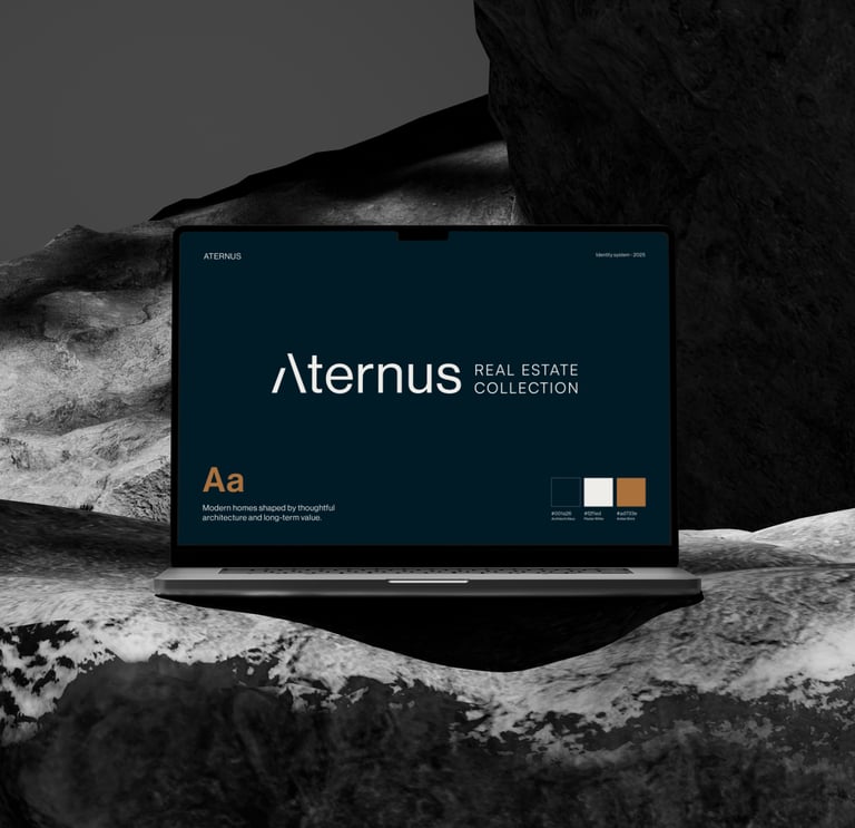
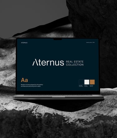
The new identity focuses on a refined typographic logo and a calm, architectural color palette, designed to work for digital and print.
The system was built to support both premium and more accessible projects, keeping the look consistent while allowing flexibility for different communications.
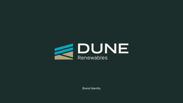
DUNE RENEWABLES
VISUAL IDENTITY
Client: "DUNE Renewables"
2025
This visual identity was created for DUNE Renewables, a newly launched engineering and consultancy company working in the B2B solar sector. The goal was to build a launch-ready brand that feels professional and trustworthy, while still coming across as young, fresh, and contemporary.
My role: I developed the visual direction and complete identity system - from the concept and aesthetic principles to the logo, typography and color palette, graphic elements, and the final brand guidelines and applications.
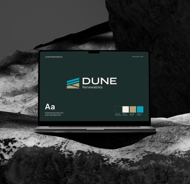
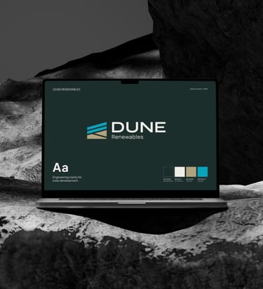

The identity balances technical clarity with an atmospheric, nature-rooted tone. The palette was designed to reference the landscape of Kuršių nerija.
Bringing a calm, coastal feel into a clean system that works across presentations, technical documents, and other marketing materials.